We live in an age of information. With modern technology, it’s so easy to gather data and then visualize it in new and exciting ways. In this way, we can answer the important questions of our time. Who are we? Why are we here? And what is our favorite beer?
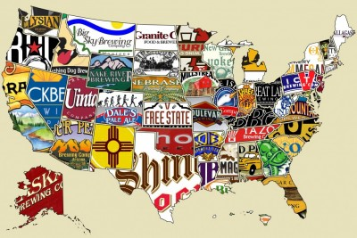
Consider the project undertook by Matt Zook and Ate Poorthuis, two geography professors with the University of Kentucky. In an attempt to uncover specific regional trends in the beer world, the two men stumbled onto a novel idea: utilizing geotagged tweets to hone in on any discernible patterns regarding beer tastes in our fair country.
The resulting information is featured as a chapter in the new book The Geography of Beer and serves as a compelling jumping off point for any discussion of how beer tastes differ throughout the country.
Below, you’ll see several of the maps that Zook and Poorthuis produced through their research. If you love beer, novel information, or both, then you’ll love looking at these maps.


- See more at: http://www.kegworks.com/blog/#sthash.4x81UPZ1.dpuf